Sunday, 19 February 2017

Evaluation Quesion 4- How did you use media technologies in the construction and research, planning and evaluation stages?


Evaluation 3-What have you learned from your audience feedback?

Planning
From the planning process we found that our target audience is from the age 16 to 22, we chose this because the artist that we have chosen is more appealing to those of this age as the research that we carried out a the beginning of this process showed that those in this age range preferred artists of Kehlani's age. As this target is very broad it allows for us to have a larger audience because if we chose a smaller gap for example 16-18 this doesn't allow for the artist to be as successful as she could be with this wider audience. When making my target audience mood board I included images of many alternative and edgy young girls because this is what the artist herself is like, she is young and he style is very unique and trending so we wanted her audience to be the same as her so that there will be this natural connection with them, her and the music.
Throughout planning we decided to research the style that Kehlani has, we looked on her social media sites like Instagram so that we can see pictures of what she looks like most of the time, this then allowed us to gain a better understanding of the RnB style that we are going to show to our audience. As the research showed that Kehlani is very trendy and current with her style, it told us that her fans will also be the same. This then gave us a better understanding and narrowed down our target audience to unique and stylish 16-22 years olds. Having this target audience narrowed down into a smaller group still allows for our artist to be successful on a large scale but it makes it a more direct approach because the audience can be connecting with our artist on a physical point as well as with the music.
Whilst planning the target audience also effected the costumes that we put Mikah in because we wanted the style to be one that they liked so from the research that we carried out at the beginning, we could apply the casual style to Mikah. This meant that our video is likely to be received a lot better than if we went for a completely different style to what our target audience wants.
By having a clear type of target audience this influenced many of our decisions even little details like the colour scheme because we know that the audience are females, but they are the stereotypical women, they are very alternative so if we chose to have the main themes of our products to be pink and feminine colours like this then they wouldn't be very effective, which is why we chose to have deeper and darker colours like the purple and blue colours we used for our ancillary texts.
When we were making the target audience mood boards, we all made them separately which meant that we all had different ideas, but when we came together to show the boards they were all very similar. This meant that we all had a clear idea of who were to be our target audience from the very start. This is good because it meant that we could move on to different tasks faster as we were all aware of the plan.
Filming and Editing
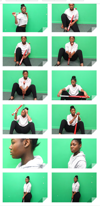
When we were filming the video we changed some of the planned scenes because they didn't look right at the time. One scene that we changed was the scene we initially wanted to have on the estate stairs at Melville Court, we were originally going to have 3 different shots of Mikah's face, but this didn't give the connection to the audience that we wanted to create, so whilst editing we decided to input a different clip that fitted the audience better. We also changed the out outfits that we were going to have Mikah wear, at first we wanted to have her as this seductive female, but then as we realised that the theme we wanted was very different to that, we wanted a strong female instead of the RnB convention of sexualising the females. This was influenced by the target audience because we overlooked our previous research and realised that these females are alternative and have a different style to the typical female so we wanted that theme to run through so it related to them as well. This meant that when filming we actually had her change her outfit so that her outfit fitted the theme.
Whilst editing we made sure that we used a lot of shots that had Mikah looking directly at the camera, this was because we wanted that relationship to be made with our audience and the best way for us to do that is when certain lyrics fitted the audience, we will have Mikah looking at the camera. Another aspect of editing that was effected was the number of shots we had with Chrissy dancing. This was effected because initially we only wanted to have a few clips with her dancing, but as we were creating the video in the editing phase, we realised that we should add more clips with Chrissy in them because it adds to the urban  and edgy feeling because of how dark the scenes were and how different the setting looked with the lights from the projector, it could have relevance to how different our target audience is. We also thought that these scenes were very eye catching and made us a lot more interested when we were watching the video through on repeat as we were editing.
We also targeted our audience by filming in attractive places like Leake Street, this was the most artistic place in which we filmed in and also the best place for our audience because it showed the themes that they like, we could dress Mikah in the casual clothes that they wanted ad have her in an attractive setting with art and colour in the background.
Feedback
For most of our feedback we created a questionnaire on SurveyMonkey, this allowed us to get physical evidence of the responses from our target audience that we need to see if they enjoyed the elements of the video in which we incorporated.
The first question is Do you think the slow motion shots worked well ? and the results are shown below

This table and graph show that overall the slow motion effects were successful because 90% agreed that they worked well. This is good because it shows that the video has been successful with our audience because 10% not agreeing is a very small amount. We used a lot of slow motion shots when we were finding fillers because we felt that it added a special feature to a basic clip which, from the result, shows that it worked. The slow motion shots were also used to emphasise a certain feature in the scene for example we used this effect when we were using the clip of Mikah in the car at the roundabout because it made the lights of the car coming round the bend stand out a lot better.
The second question was do you like that we had a performance in our video?


We chose to have this question because the performance was one of the main features of the video so we needed to know if it was a good choice to have a lot of shots in the music video with the dancing. The results show that this was the right choice because 100% of respondents enjoyed the performance in the video. This is good because the reason we added so much of the performance was to reach out to our audience, so to see that this was worth adding extra it means that we were targeting out audience very successfully.
The third question was Did our product conform or subvert to the typical conventions of an RnB music video? The results are shown below in a graph format with comments from respondents also.


The graph shows that most of the respondents think that we both conformed and subverted the typical conventions of the RnB genre. This is the result we want because it shows that the audience have understood the video and what we have tried to do. We initially wanted to conform to the conventions but as we figure out our target audience we realised that we also want to subvert them because we have an alternative audience. This means that our video has been very successful because the message we wanted to put across has been shown and received successfully from our audience. The comments that were made shows that having both conforming and subverting the RnB conventions was a good decision to make because they actually liked it. One comment stated that it did this "In a good way" which shows clearly that they think the decision was effective. Other comments suggested that they saw elements of pop music in the video which wasn't the image we were aiming for but they haven't said that this made the video look bad in any way, so its still a positive.  Another comment that showed our video worked well is the one about giving Mikah characteristics of a man with the bat, this is a positive comment for us because we didn't want her to be this feminine character and w wanted the power within masculinity to shine through with the bat, which the audience could see.
The next question was Do you think we addressed our target audience well (16-22)?

This question was very simple and the results show the answer we wanted, they show that 100% of the respondents agree that this video does fit this audience. This is good because the main aim is to make sure that the video suits and fits our target audience, so by doing that through this questionnaire, shows us that we have been very successful in the process of making our video because it has achieved the goal we wanted. It also means that we do not need to change anything in our video to make sure the audience are targeted because we have already made sure it fits them. We used this question within our questionnaire because we think that it was the most important one because if an artst does not reach their target audience then they would need to change their product or their audience, but as we have been very successful with doing this, we don't need to make any changes.
The next question was Do you think our video was successful or unsuccessful?

This question was also a very important one, it shows that the majority of our respondents feel that our video was successful. This is very good because it shows that most people liked the video and only a small amount didn't enjoy it which isn't as big of an issue because these people not like the video due to factors that we cant control such as their genre reference or their style of music, because not everyone we asked the questions to like the song or this genre. So this 10% doesn't really effect the successfulness because they are a small minority.
This question also included written responses that are shown below


These results show that the main drawbacks of our video are the lip syncing and clothing choices. As we were editing we did notice that the lip syncing was definitely our weakest point so to have the feedback discuss this issue it is not a shock to us and if we were to do it again we would make sure that Mikah pronounced the words slightly more to make it look more realistic especially on the longer notes. The comments also suggest that we should have kept to the colours we intended to, which was the grey and black theme and not have the brown jumper. They may be against the jumper because it isn't very edgy and we also regret having her wear this jumper because we don't feel as if it fitted the urban theme because its quite formal and normal so our artist didn't stand out as much as she should've. Another comment suggested that we should have edited the lighting a lot more with the graffiti scenes because we could've made it brighter and more vibrant. However during the editing process we did attempt to do it but with the technology that we had it made the shots look very amateur like and unprofessional so we decided not to adjust the lighting because it looked more professional without its adjustments..


Evaluation Question 2

Here is a video of our evaluation for question 2 but it is in two parts because of technical issues.
Part 1
Part 2

Evaluation Question 1

In what ways does your media product use, develop or challenge forms and conventions of real media products?
When we finished making our music video we decided to upload it to YouTube, we did this because it allows other people to view it as it has a large social media platform where many other artists have been discovered and where very successful musicians have started their career like Justin Bieber. We used YouTube instead of other social media sites, because it is extremely popular and the number of people in total that have views this one site in the first 6 years was over 1 trillion people. This means that there would be a much higher chance of it being viewed the song being progressed into a bigger song just like what the artists discovered on YouTube would have done. By uploading our music video to YouTube we are not challenging the usual uses of a media product, instead we are conforming to what most musicians do with their music videos because if we challenged it then we wouldn't have the feeling that it is a professional product.

Advertisement
The advert that we created is shown on the right and it will be shared around on social media platforms because the audience will be much wider  than the audience we will get from a magazine because its much more accessible to see an advert on a social media website than go into a store and see a magazine cover with our advert. This is also more suitable for our target audience which is the ages 16-22 and most of the people this age would have at least one social media platform where they would be able to see our advertisement of  Mikah. The colours that we used are very feminine colours like pink and purple but they are cool tones so they still show a bit of the darkness that we want Mikah to portray as her character. As we have shown other social media websites like Twitter, Facebook and Instagram where our audience can follow our artist which is an idea we got from looking at other music advertisements because it will allow the fans to have more contact with the individual and they will be able to see more information about the tour. Another feature we included for our advert that we saw when researching was that we included our record label logo, this will allow people to know who the artist is signed with and if our audience like our artists then they would be able to do further research into who else we have signed to our label if we were a real record label which would widen our audience for the other artists. We chose to write at the bottom of the poster 'Album now available on iTunes and in stores', we did this because it makes the advert look like an official advertisement because most artists have their music on iTunes. This also widens our audience because they are able to either by it on the app or if they prefer a material copy then they can buy it in a store. This shows that we don't want to exclude anyone from being able to buy the product.
Music genre
The music genre of our video is RnB soul and throughout our video we have both challenged and conformed to the conventions of our genre. As the genre incorporates both RnB and soul music, it means that we are allowed to show the sexiness of RnB with the emotional and story side of the soul. In our video we have challenged the conventions of RnB artists like Rihanna because even though Mikah's body is not fully covered up head to toe, her body is not being sexualised with her clothing or costumes. This is because we went for the style of Kehlani herself who in some of her videos is dressed in seductive clothing but we decided to have the urban and stylish side of her as oppose to sexy. The clothing that we used in the video consisted of a dark tops, ripped jeans, black jeans and black long coats. These neither show or hide her body because with the ripped jeans they showed a lot of her legs and they were paired with a white and black top with a long black jacket. This collaboration allows for Mikah to look urban with the subtle bit of sexiness with the upper thighs being shown through the rips. The locations that we chose however does fit in with the RnB style because she was filmed in very rough and urban areas because we went to London and filmed in places that showed graffiti which is a key when giving off the impression to the audience that we are in a modern city. Another location that is featured in our video is in an abandoned warehouse that has been destroyed and vandalised throughout the years. This location challenges the conventions of the RnB genre because even though there was graffiti and vandalism in the warehouse it was very dirty and abused which often in music videos for RnB they are filmed in lavish places with a lot of money, or in an urban area, to which this location was neither of them but it still looked like an RnB music video even with a completely different setting.
The other location featured in our video is Mikah driving in her car, we used this because we wanted our artist to be relatable to the audience, so by having her do a daily job in the video would make that connection and form a bond between the artist and the audience. It also allowed us to have the dark lighting because we were filming at night so the darkness worked well with the street and car lights, which is a theme in many RnB videos, to have the dull lighting with the bright colours of light for example the previously analysed Bryson Tiller ' Sorry Not Sorry' music video. He used very dark scenes at night and made the red lighting and the yellow lights stand out which we did when we had the scene of Mikah' hand moving outside of the car, in the background you can see the car lights in front and the street lights because it lights up the scene whilst still having it dark.
As we were editing the music video we wanted to show the beat through the images so we decided to create a jumping motion of one scene because the beat makes a jolting sound so by editing this effect onto the shot it showed the video being in sync with the song because they are both doing the same motion. This is the scene when we did this editing technique.
This effect is conforming to the RnB genre because many other music videos have used this technique because it emphasises the importance of the beat and as in this genre, the music is almost more important than the lyrics so the emphasis needs to be shown through the video.
Whilst editing we also decided to make the dancing fit with the beat and rhythm of the song and we made Chrissy come in on the beats which fitted the dance moves that she was creating. This again adds to the conventions of an RnB video because the type of dancing that Chrissy was doing was very urban and many Hip Hop and RnB videos show this style of dancing especially when the music has a lot of variance in the beat, it can be used to show a change of tone and feeling, without having the artist or main character show it. This is why many motions that Chrissy does actually fits with the way the lyrics are sung, for example if Kehlani is singing a line that might be slower or flow more than the others, then we slowed the clip of Chrissy dancing down, so that it fitted with the music and the relationship between the music and character was created. Our inspiration for this relationship was Beyoncé's Formation music video  https://www.youtube.com/watch?v=WDZJPJV__bQ because from the beginning the beat is in time with the shots, every beat has a different shot and then whenever the characters are dancing the beat fits it perfectly, which is what we wanted for Chrissy's scenes. Also dancing is the main theme in this video so for it to be our inspiration I allowed us to gain better ideas for what we want our shots to look like. We chose Beyoncé rather than another artist with dancing in their music video because she represents the female gender very positively by being strong and powerful which is how we wanted Mikah to be shown.
Our main representation for this female artist was to show her as a strong and powerful woman that wants love, but we didn't want to make her too feminine because this may make her look weaker but we didn't want to our gender representation to be of a weak woman. We did this through her clothing and poses. Within the video as I have mentioned before her costumes covered most of her body other than her thigh with the ripped jeans. We did this in a very masculine way as the outfit she wore was actually a men's top with a long jacket, so we included the sexiness with the masculine outfit so that we didn't show her to be feminine. In most of the scenes Mikah was standing up ad walking, this shows that she has power because she is standing physically on her own as well as metaphorically, this shows that even though she wants love from a 'gangsta' she doesn't need him to make her a woman. We wanted to show this so that we show our target audience a strong image of a woman that could be a positive role model.  
Digipak
For the Digipak we wanted to conform to the usual CD cover with the little details but we did also challenge some of the conventions. For the front cover we decided to have Mikah sitting I front of a graffiti background with a bat in her hand, this is the inspiration from the Suicide Squad film, s the bat represents the crazy in Mikah that Harlequin has. This is conforming to the RnB stereotypes because artists like Beyoncé have used a prop like this before in a media product like her ' Hold up ' music video. So for us to show Mikah to have this bat in front of the very urban background it shows the audience that she is fierce. The colourful background allows Mikah to stand out because she s wearing very plain coloured clothes grey cropped hoodie and black trousers. We chose to have her wear thee plain colours so that the background could be colourful without overpowering the cover.
 The inner section of the Digipak has an all black background which challenged the usual style of digipaks. We wanted to challenge it because out artist is very unique so we wanted o make some features of the lack unique as well. This is different to other female artists like Rihanna's Digipak because she has focused on the background as the main part but we have made the CD and the lyrics to be what we want our audience to focus on. For example Rihanna's Digipak for her album 'LOUD'. As you can see her pack I very different to ours, the inner section has a picture of her with red roses and a lot of colour, but ours is very plan because we wanted the CD to stand out. As we wanted the CD to stand out we made it have the same graffiti as is on the front cover because we wanted it to have continuity throughout. On the other side of the Digipak we decided to have lyrics of the song on half the page and then 3 images of Chrissy dancing in he music video. We chose these pictures because we wanted to give the audience a preview of what is in the video. Also because the colours in the clips are similar to the colours we have used for the back of the pack, as they are blue and purple lights from the projector. These colours on the images allowed us then to change the colour od the writing on the lyrics page because originally it as white because it stood out well against the black, but when we input the pictures we found that if we add this blue colour to the font then it will bring out the importance of the colour in the pictures of Chrissy. By having lyrics on the left side of the pack it conformed to the usual RnB packs because many artists put their lyrics to the songs in a booklet within the case which is what we also wanted to do.
For the back of the pack we wanted to have a picture or Mikah again as we had Chrissy in the middle section, so that the artist was the main feature. This picture is again with the bat because we want it to be like her trademark so that she can be identified in different ways. The colours that we used are challenging the usual colour that female use, because artists like Rihanna use very soft colours and bright colours like red and pink, but we have used this dark blue and purple scheme that fades into black because it suits our artist much better than feminine colours.
Overall I think our ancillary text have been very successful with showing alternative representations of the female artist in the RnB genre because many male artists show women to be sexualised in their music videos with seductive and sexual clothing and style, but we have made sure that our artist ha a more masculine approach with the style but whilst still looking feminine and sexy without the sexualisation that men often create. However we have also conformed to the way that female RnB artists like Beyoncé are represented with the powerful female theme that e created without using any images of men or with any theme of dependence.
 

Saturday, 18 February 2017

Colour schemes for the digipak

Colour scheme 1
 This design was our first idea for the background of the back of the digi pak, we wanted to have colours that weren't too feminine because that isn't the image we have portrayed of our artist and we want everything to be similar. So we tried a bright blue fade into a pale green because the two colours work really well together, however even though we don't want a feminine colour, these colours were too light to make the big statement that we originally wanted so we decided not to use this colour scheme. Also the green isn't very dangerous or fierce so it didn't link with the previous themes we had created within out music video.

Colour scheme 2
This second colour scheme is very different to the one above because we tried to go for a completely different idea but still keeping the fading effect. The colours are purple, pink, red and orange, these are all very statement colours that stand out very well. But once we put all of these vibrant colours together we found that it was too much and the fading effect didn't work at all because there was too many colours that were too bright together., because of this the scheme created these lines that made the background look very blocked and the flow didn't work as well as we wanted it to. These are the reasons for why we decided not to chose this design.

Colour scheme 3

This colour scheme was the third one that we created, we used much cooler tones like the ice blue and the white and lilac which was very different to the warm tones that we used in the scheme before. We definitely preferred this undertone because you can use colours like purple and blue in a less feminine way to the warm colours. Even though we liked the cool tones, we still weren't too sure about using all of these colours together because we used blue, pink, purple and white which were a lot so the flow effect still didn't work the way we wanted it to so we decided that for the next design we will need to use less colours so that they don't block together.

Colour scheme 4
This colour scheme was the final one we made and the one we chose to use in our product. We chose this because the darkness really fitted with the theme we had in our video because we included many dark scenes which correlate with these colours. The way the purple effortlessly flows into the black also looks very natural which we made by using less colours so this time instead of using 4 colours we used 3, purple, dark blue and black. This scheme was also the best because it has the dark purple which is a very powerful colour which we want to show our artist to be, very powerful and strong.

Production schedule for music video

This is the production schedule that we made so that we had clear dates for when we were filming so that we could get it done quickly so we had enough time to make any changes that we may have needed and to edit the best we could,

Behind the scenes footage

This is some visual footage of us filming the music video in the abandoned warehouse which was the first time we went out to film
Here are some photos of us editing our music video at school


Final music video

This is our final music video that we created


Digipak Poster

This is our final poster for our advertisement for Mika's tour, we decided to have this be shared on social media rather than in a magazine because it will be more suitable for our target audience as the younger generation are much more likely to see an advertisement on a social media site than in a magazine.

Font ideas

When deciding the style of our font we conducted research into what type of style we want by looking at a font website and picking a few that we liked and then figuring out the type of font we wanted whether its thin, thick, bold or small, so we narrowed it down to 5 different types.
Font 1
This is the first choice of font for our ancillary poster, this is very thin, sleek and simple. We liked this because its bold but thin which is hard to find because often if something is thin then it means it doesn't stand out a much as we would want it to, but this design did both. The capitals also makes it bolder because it makes a bigger statement like this artist is important because of the capital letters.
Font 2
The font is completely different to the first font because it is thick and dark. This font is effective because it would stand out up against bright colours and any background which is good because we are planning to have graffiti with bright background for our products so this would really work well. However there is a drawback to this font which is it looks a little bit tacky and basic because the thickness is so drastic, which is one of the reasons why we wont be choosing this font.
Font 3
 

This font is very different to the typical font that would be seen on media products, it has the pencil effect and almost like a scratched look which could make her look very alternative and give her the edgy image we want for our artist. However up against colour this font might be covered up too much because he colour is slightly grey and very light it may not be as easy to see as a font that is completely black.
Font 4
This is the final font choice and the favourite choice for our artist, this is because it incorporates the thin effect in which we wanted and the height of it gives t a professional feel. The letters are also quite narrow which we like because it makes it look cleaner than a thick and bulky font like the second option that we had.
 

Ancillary text photo ideas


When we were getting the picture for out ancillary text advertisement we took a selection of photos to choose from so that if we didn't like out initial idea then we were able to change it for a better image.
Our initial idea was for Mikah to hold the bat around her head onto her shoulders but as we were taking the pictures we noticed that this pose was not the best for her and she wasn't very comfortable posing like that so we decided to change the positions. After this we got her to sit on the floor with her knees bent in a natural position so it looed like she was just sat there effortlessly. This was the most successful pose so we then decided to get her to change the positioning of the bat from on top of the knees to leaning on the wall and holding it with both hands, we got her to do what she felt was most natural to do with the bat. This did take some time because Mikah is not used to holding a bat in this type of situation but she quickly go used to it.
After the floor shots we decided to get some close up shots this was so that we could get Mikah's piercings in the shot because we originally wanted this to be her trademark, but throughout the process we realised that this isn't the easiest thing to get to seamlessly for the music video, so instead we thought we could try to include it in the ancillary text and digipak, but this was again unsuccessful.

Digiak design


Storyboard


 The first storyboard is showing what we want for the opening of our music video which is possibly the most important part because we need to catch the audiences attention. The locations we want for the first scene is to be in Leake street this is because it has vibrant artistic colours which are needed for us to make out video stand out to others. We also want her to walk towards the camera which will create a relationship between her and the audience. The second shot is to be at Fort Amherst, this shot is going to be in the night time and she is going to over look Chatham with all the lights on to give it the urban feeling. The next shot is to be in Medway tunnel in Mikah's car and we are going to film her in the passenger seat whilst she id lip syncing and driving. This will create the realism feeling we want in our video to show that she isn't any different to her audience The next shot will be in the car again but the camera will be in the back seat and someone will hold it outside the window filming Mika's hand moving in delicate motions flowing in the wind. Then we will get shots of her on stairs to create the urban feeling again, possibly in London. Then we do the next line at the flats in Brompton so that she can be filmed from three different angles as she says 'nobody' three different times and we can get close ups of her face which will make the audience feel closer to her.


For this section of the video we will have Mikah leaning against the wall in Leake street with the graffiti again, singing a small part of the line and then we will have a quick change of shots to a close up of Mikah's face when she says the other lyrics as the line is very sexual we think it would be most effective if we show her lips more as they are often sexualised when lyrics like this are being sung. We will then film in an art museum because we want to keep the artistic feel within the location where she will be touching the expensive artworks to show that she can have anything. The museum that we are thinking of using is the Victoria and Albert museum because it has many different styles in which could be relevant to out song. The next shots will be of 4 different people moving their fingers to their lips in a 'shh' motion, this is to relate to the lyrics which are 'nobody, nobody, nobody, knows'. So to show that nobody knows we are using other people as they can represent everyone that doesn't know. We will then use the original music video and project it onto a white wall and have Mikah in the shot to the side watching the video as it plays the scene from the film itself which is Harlequin and the Joker in the car together, this is to show the love that Kehlani wants to have. The next shot will be quite long with Miakh walking in Leake street with the camera but then as she is turning away she will continue the lip syncing.


For the next shot we want to film Mikah walking beside a wall with her hand dragging along to create a seductive feeling. Then we will add the clips of Chrissy dancing, we will have Chrissy dancing in our main hall on the stage with the projector playing the original music video for Kehlani Gangsta, this will look really effective because the wall it will be projecting on is all black so the lights will stand out really well. Then we will have a filler of Mikah looking up directly into the camera lens
then a quick cut to her lip syncing. We will then have another shot of Mikah in her car as it will fit the lyrics for the line which is "to ride or die with me" this will create the relationship between the lyrics and video which will relate to Andrew Goodwin's theory of a successful music video. Then we will have more interaction from Mikah to the camera as he will sing her line then turn away from the camera and walk away. Then we will get different shots of Mikah in different settings which will show her walking away from the camera to end the video which will show all the places she has been throughout the video and consolidate it in a clean way,
 

Digipak CD design

This is our final design for our digipak


The Weeknd Starboy Analysis

The Weeknd - Starboy
I have chosen to analyse The Weeknd because this music video is  not the typical RnB music video as many scenes challenge the stereotype but there are also many aspects that conform to the conventions of RnB music videos.
The first scene in the music video shows a dark room with the camera moving towards the light coming through the door that gradually opens more as the camera gets closer. This is a very strange introduction to an RnB music video and the sound of the music at this point is also very different, the beat is not very upbeat or deep like the usual sound but its much slower and higher. The shot is very mysterious and dark which makes the audience feel very curious at to what this video in tells.


The first time we see the artist is in this shot with him and what appears at first to be someone else, but he is not sat there by choice he is tied up. This again adds to the story of the video because we can now see that there is a message or story behind this song which the artist is going to show us throughout. This wide shot allows us to see the full table and that there are two people both at each end of the table which looks very formal and set up. The lighting is very dark with the blue tones in the sky standing out in a deep way and the bright yellowness of the light also stands out. The reflection of the glass light onto the glass window appears to show a cross which resembles the religious Christian cross which is a continued prop later on in the video. The lighting also makes the two characters appear very dark and with the dark clothing which the currently unknown character is wearing makes it hard to make out his face and its still a mystery to who he is. The distance of the shot also allows us to see the location of this setting which looks like its quite isolated from other houses and cities because there is only a small amount of light on the left side from outside places. This could be to show the danger in which the artist may be because there aren't people around to help him.
This shot shows the lighting in the same way with the underlining blue tone even on his leather black jacket. This jacket makes him look very alternative and dangerous which is a stereotypical image which RnB male artists portray. The cross on the necklace is shown very clearly in this shot and the black background of the shirt and jacket emphasise the necklace which is what the artist wants to do as it suggests that this is a key theme within the video. The shot is very simple and basic but with the cross being central it gives it a deeper meaning than just to show is jewellery because it could be suggesting that he has a strong religious belief with God and that is why he has included it in many of his shots. The thickness of the necklace and the chain itself adds to the masculine figure in which he is portraying because as its very chunky and not delicate and fragile, it shows that e has a care for God but in a strong way.

This is the first time we see the cross to be the only item in the shot and its extremely bold with the brightness of the red illuminating the wall it lies on. They have contrasted the lighting completely as it went from the deep blue tones and bright yellow, to this vibrant powerful red shining bright all alone. This is making it very clear that this cross has a lot of meaning or symbolism to the artist because of how much power he ha given it in just this one shot. The shot is also very slow as it zooms in closer and closer which blend with the other length of the shots with the artist himself in because the beat itself is quite slow, so for it to have slow shots it means that there is a relationship between the beat and the video.

This shot has the similar lighting to what the video started like, he yellow tones n the fire have been brightened and exaggerated to show the burst of light the scene needs so that the dullness of the dark black does not drown out the colour that they want to be bright. Throughout the video there is another theme of destruction and this shot adds to it with the fire burning, it continues the breaking glass and tearing the house down which we previously saw with the big red cross. The yellow light in the background does make the artist stand out much more against the light and almost illuminates him, and makes him look darker because it creates a boarder around his body especially his face. This makes it clearer to see the balaclava in which he is wearing which is often associated with danger and gangsters which could be showing the audience that he isn't who he used to be, he has changed which seems  to be a strong message within the video because from the start we saw him killing himself but who he used to be and the destruction could be just to show that he is changing so everything will be new and different.

Analysis of student videos

Rudimental- Powerless
I have chose to analyse this music video because it has a main story through out which is different to the previous video that I analysed and the way the story is told could help us with our own video if we decide to have a story.
The way this video starts is the same scene as it ends which means they are foreshadowing the end result of the story. By showing this at the beginning shows us that this music video is going to tell a story which is a very popular decision when artists make their video as you can show the meaning of the song in a clear way so that there are no misunderstandings to what the song means. The shot itself is very clear as is the rest of the video, it shows the main character winning a boxing match, this is clear through the Mise en Scene with the boxing gloves, the clothing he is wearing and the background as you can see a bit of the boxing ring sides. The lighting that they have chosen to have is quite dark especially around the edges of the shot which centralises the characters and allows us to focus on them and not be distracted by the items in the background that they don't want us to see.
This shot that they have chosen to take is showing the setting and where the character lives, it appears that he is looking over the town from the top of a hill and as the video continues the camera pans up until he is removed from the shot. They could be doing this to possibly show an exclusion and maybe the boy is excluded from the society in which he lives in because the way the shot starts with him looking out to the town and ends without him, is shows that they are separating to show a social exclusion and isolation that the character may be facing.
This scene showed the boy to have some sort of inner person which they displayed through the editing as they overlapped their main character with another person which appears to be him when he was smaller and weaker. This is where the story begins to show depth as they are telling us that he didn't used to be this masculine boxer that we saw at the beginning, but he used to be a little boy that couldn't fight back which shows us that he has a reason for being a boxer. This also relates to the song title 'powerless' because he was once powerless and he is powerless in the boxing ring when he loses against his component but at the end he is not powerless, but he is powerful. They have also made the scene black and white which could be to show the different time period or the past and the dullness of the grey and black also tells us that this wasn't a happy time for him because of the lack of colour and vibrancy the shot has.
This shot uses a lot of editing techniques that work very well together and some are repeated throughout the video. The fist technique that I notice is the use of black and white again, this is definitely use to show a sad time because this is the current time and he has been knocked to the floor, so it shows that when the emotions of the character are at the lowest, the scene will be switched to this black and white filter. This is good because it allows the audience to be aware of the characters emotions without using specific imagery or actions, instead the change of colour can tell us. The second feature that I notice is the focus of the cameras has changed, they have blurred out the background with the component standing above the character so we can see clearly that he is down on the floor. It not only shows us that he is down it also shows us that he is exhausted ad his energy has gone because of the way his body and face is displayed. The key theme in this video appears to be power which is relevant to the song itself and in this shot it shows us that he is the powerless again because of the way the camera has shot the scene from a low angle and from the view of the main character in the background even though it has been blurred out it is still very obvious that the component is of a higher power than he is at this moment because of the physical level of him being on the floor and the other boy standing over and above him.
The relationship between the video and the beat of the song is very strong because the song has many fast beats and slow beats which the video conveys through the length on the shots very well. This is shown near the beginning when the beat it starting up and getting faster the shots get faster and so do the actions in the scenes, the characters move with the beat through the boxing.

Analysis of student videos

 Walking with elephants
I have chosen to analyse this video because I think it is one that my group should aspire for our video to be like because all the shots look so professional and high quality and the beat fits the timing of the shots that they have and overall it is one of the best student music videos that I have seen.
https://www.youtube.com/watch?v=498oCIxE7fI

 From the very beginning they have this surveillance camera effect on the shot which shows them running up the stairs. This effect makes the shot look very real and as if they have actual footage from a CCTV camera which starts the story that they are going to tell through out the video. This filter suggests that they are being watched by someone that they might not want watching them and also shows them as doing something they maybe shouldn't be doing. This would not be as clear if they hadn't used this effect and would have taken more time for the audience to understand the story if they has used a normal effect.
In this section of the video they used a darks background and lighting with vibrant colours like spotlights of blue, red and green to shine on the artists face and body. This was very effective because f allowed us to see the lyrics on the screen very clearly because of the dark background. The lighting worked very well also because the vibrant colours were very little but made the shot look a lot less dull than it would if it was just black lighting with the white writing on top. The white writing was very large and bold and stayed on the screen very briefly as each word appeared because the lyrics were very quick. The worlds were shown on time which was good because if thy were out of time with the actual lyrics then it would look very sloppy and rushed. In this shot even though you have the dark background and the titles covering the artist we are still able to see him lip syncing and singing along with the song so that we aren't excluded from the artist.
There were also many shots that had been layered so that I had the effect of flickering and almost jolting which fitted with the beat every time they made this effect. They also used images of other media products within their video for example there was a section with a clip of the lion from the Life of Pi movie which was related to the lyrics of the song "kinda like the Life of Pi". Having this clear relationship between the lyrics and the video shows us that they have analysed the lyrics in detail and tried to visually show them in multiple different shots as they do this in another scene with the Fresh Prince of Bel Air logo and Saved By the Bell, these were in relation to these lyrics, "Bit nostalgic now I'm feening Fresh Prince, Saved By the Bell's what it might be".
Another  technique in editing that they used was this multiple clips of the same shots, this shows that they want repetition and perhaps emphasis on this specific shot because they are showing it 9 times. This shot is very simple to create but has a very large effect because it can show a lyric repetition or emphasis an important lyric in the song whilst looking professional.
Throughout this video their strength is editing and this clip shows an intricate geometric design on the outside almost like the background to the rectangle shot in the middle with the artist in the centre singing. This is one of the most professional shots in the video because it shows so much all in just one shot, we are able to see the artist singing, the location of him and the colourful background relating back to the lyrics again. This is proving Andrew Goodwin's theory of music videos that there needs to be a relationship between the lyrics and the visual aspects of the video.
This shot shows all of the characters and artists involved in the song in a high shot from the sky that looks very clean and clear. This allows us to see their location which appears to be in a garden or in the grounds of a place that hasn't been shown in the video. It also allows us to see the Mise en Scene with their clothing which is very dark with black, khaki and blue as the main colours of all their outfits. This adds to the mystery of the story that they are trying to tell because dark colours are often associated with mystery and the unknown. Using dark colours also makes them look more professional and as they are apart of a close group because they are all in very similar clothes they all have a visual connection which the audience are able to see with this wide shot.